Mu Primer
Manuscript
Chapter I
The Mu Typography
There is great incongruity between the way we write and the way we see. Our present methods of displaying printed information make it unnecessarily difficult for us to apprehend and understand that information. Through the employment of a few readily adoptable devices, the process of reading can be made easier and more satisfying for most readers. One of the devices, the mu typography, is described in this chapter. The mu (pronounced with a long u, as in mutation) typography removes some of the impediments we now impose on ourselves with the linear typographies that we use in setting printed text. The mu typography enables readers to assimilate text more efficiently and more rapidly – and to comprehend and retain the information more easily – than is possible with text set in lines of print. Most literate individuals will be able to learn to read text set in the mu typography with the training and practice materials that are provided in this book – hence its title, The Mu Primer.
The Basic Ideas
The mu typography is a perceptually more efficient way of displaying printed information. The two principal ideas underlying the mu typography are:
1. The display of text so it can be seen more easily – the display of information in a way that better conforms to the capabilities of, and makes better utilization of, the human visual system.
2. The display of text so it can be understood more easily – the display of information in a way that permits the reader to see a logically related group of words with each fixation of his or her eyes.
The logical word groups referred to above are called meaning units. In English, a meaning unit is either a sentence or a logical subdivision of a sentence. (Meaning unit is usually abbreviated by its acronym mu.) Meaning units are word clusters arranged so the reader can see the entire cluster with a single fixation. For example, the sentence:
The quick red fox jumps over the lazy brown dog.
might be displayed in the mu typography as:
![]()
or it might be displayed as a single muglyph:
The
quick red fox
jumps over
the lazy brown
dog.
Each of the three muglyphs in the first example can easily be seen by most readers with a single eye fixation. How many individuals can see and learn to read muglyphs as large as the second example (five lines/ten words, or a 5/10 muglyph) can only be determined by additional research.
(Over 500 pages of examples are included in the appendices. In addition to the 500 pages of practice materials in Appendix A, the text you are now reading is also repeated in the mu typography in Appendix B.)
And then typography has been evolving some hundreds of years under stress of economy, not of the eye and brain so much as of the printer's paper and the printer's ink. Printers and publishers have been industriously developing the system of straight, thin, horizontal lines made up of groups of little black strokes packed in neatly and compactly. But do we know that this development has not been straight away from the arrangement most suitable for quick and easy reading? It is true that fatigued readers have had some selective part in this revolution. But they have been offered a most limited range of variations from which to choose, and the fundamental notion of line arrangement and word arrangement remain as immutable as the fixed species of Aristotle. Can books and periodicals be printed so as to lessen fatigue, to decrease the tendency to myopia, to increase the speed of reading, to permit more fluent interpretation? Can pupils be profitably taught to read faster or more slowly, to visualize or auditize or motorize, in general can they improve their reading method? These are some of the pedagogical problems to be finally solved by such an analysis of the reading process.
("On the Psychology and Physiology of Reading,"
American Journal of Psychology, April 1900, pages 283-302.)
In 1943 Lillian Lieber in The Education of T. C. Mits (The Celebrated Man in the street) proposed and used a typography that consisted of one phrase or a few words per line, to wit:
This is not intended to be
free verse.
Writing each phrase on a separate line
facilitates rapid reading,
and everyone
is in a hurry
nowadays.
Robert Andrews, in an article entitled "Reading Power Unlimited" in the January 1949 issue of The Texas Outlook proposed the use of the square-span typography, which he illustrated as follows:
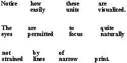
Andrews' article specified many of the basic features of the mu typography.
[pages 8-56 of The Mu Primer are under revision]
Return to The Mu Primer table of contents
Copyright 1999, The Mudoc Corporation